What’s better than a daisy? … a BRAND NEW daisy.
Listen to what’s brand new from Brand New:
Peter Bjorn and John Relive Things with Mick Boogie — And the result is eclectic and engaging.
Enjoy a nice big bite of PB and J at this address:
WHY? not listen to Eskimo Snow?
Check out the latest from WHY? at this adress:
Ludo — Broken Brides
Check out the latest from Ludo here:
First Impressions: Viewing a Traditional Medium Through an Untraditional Lens
Yesterday I had the opportunity to quickly pop into the MCA and check out its new exhibit, Constellations: Paintings from the MCA Collection, and was pleased to discover the MCA’s approach to presenting paintings by recontextualizing them.
Most art exhibits showcase one artist or genre of artists in a safe, contained, chronological manner. Constellations rebels against this traditional layout almost combatively, by opting to group paintings in “constellations” based on a common subject or stylistic decisions rather than by reducing them to their genre or time period. This provocative creative decision makes for an original, conceptual, and academic exhibit in the best way possible. By approaching curation from such an unconventional angle, the show’s curators highlight the futility of attempting to categorize art. The show’s title, however, while clever, doesn’t necessarily fit what is presented in the galleries. Constellations work together to cohesively present a larger image, but often these grouped paintings seem to exist as free-floating entities sharing a space rather than a collection coexisting diplomatically. While the artists’ concept, subject, or idea in a given constellation may have been similar, their varying artistic interpretations differ greatly, and in doing so, do not reflect the unity, so much as the diversity that exists in painting as a medium.
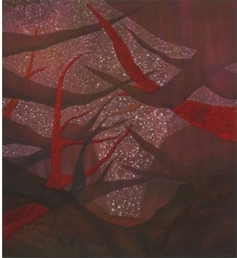
Vasell's moody, pensive interpretation of a forest.
For instance, in a gallery thematically centered on depictions of landscapes, Laura Owens’ “Untitled” is displayed next to Chris Vasell’s “Untitled,” a creative decision which highlights the two works artistic differences, rather than their thematic similarities, as their drastically contrasting interpretations of a forest scene rips the common thread of subject apart at the seams. Vasell’s darkly gnarled and knotted forest of piercing sharp plum-maroon tree branches (some of which are textured like bark) are placed against a starry eggplant tinged night sky. This small, intimately tight knit work seems to leap away from Owens’ enormous canvas of cast white fog through which peeks one fleeting glimpse of tree trunk. Together, these two pieces encapsulate the epitome of small vs. large, open vs. cluttered, and pitchy, mysterious dark vs. insane-asylum white. They create drastic opposition, fighting each other rather than intermingling calmly through their common subject.
There are, of course, moments where similarities stitch works together. Paintings integrating popular media, for instance, knit a more overt thematic yarn, creating a sense of artistic unity in form and intention. This kind of togetherness also exists in the gallery displaying non-representational art, which gives the immediate impression of a common agenda, of several artists speaking in unison. Nevertheless, for the most part, the MCA’s Constellations rarely blend together to present an image as clear as Orion of the Big and Little Dipper—instead, presenting a wide range of artistic visions which together create a diverse artistic canon of wildly different visions, stories, and messages. When grouped together, contemporary paintings do not present the overt connect-the-dots clarity of the images found in the stars—nor should they.
The AIC Explores the World of Wine
Today’s blogging adventure brought me to the Art Institute of Chicago for, after months and months of ooh-ing and ah-ing over the new Modern Wing, something completely and totally unrelated to the world of conceptual art or architecture! This time around I stopped to check out the museum’s latest endeavor, an enormous exhibit about a beverage that, if the curators at the Art Institute are to be believed, makes the world go round—or, at the very least, has held a central position in multitudinous cultures practically since the dawn of time: wine.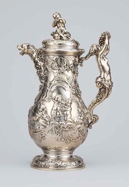
My presumptions about the exhibit, entitled A Case For Wine, were incorrect from the start. I assumed this exhibit would be about wine casks and how they’ve evolved over the centuries. In retrospect, this was an oddly literal interpretation of the show’s title. Nevertheless, upon realizing the exhibit was really more about how wine’s cultural role has evolved over the centuries, using art and decorative wine paraphernalia as a societal gauge, I sallied forth to see what the show had in store for me.
What it had, primarily, was an impressive collection of wine accessories displayed very tastefully, as well as several interesting facts. But in all honesty, I felt like this exhibit focused more on the history of wine than on wine’s role in art or wine accessories as an art form. This was the type of show one would refer to as “educational”—not necessarily a negative…just, not necessarily artistically focused, either. However, to the AIC’s credit, the works—ranging from chalices, to bottles, to paintings, to viticulturally themed embroidery—were tastefully displayed in low-lit galleries, giving one the feeling that you’re in a wine cellar—a dignified, restrained setting that honors the wine. The walls were painted deep grapey tones—ranging from rich, opulent burgundy to dark vine-colored green to dusty brown plum. And, if the goal was to teach me about wine as a cultural staple through the ages, then goal accomplished, AIC! Let’s wrap up this post by putting my educational experience at A Case For Wine to task. Here are my top three fun facts gleaned from the exhibit:
- After the Reformation, Protestant churches melted down several elaborate Catholic ceremonial goblets into simpler, humbler serving cups.
- 19th century cartoonist and general socio-political snark Honore-Victorin Daumier apparently enjoyed mocking the wine community as much as he enjoyed mocking the rest of 19th century French society. In the AIC’s exhibit, there are roughly ten lithographs by Daumier commenting snidely on class-relations, weather speculation, drunkenness, and any other social flaws that could possibly relate to the world of French wine production in the mid-1800s.
- While the AIC’s latest show may not be for everyone, wine, evidently, is, as the exhibit contains objects from all over the world, ranging from France to Egypt to China to Greece. So, if you want to learn about wine, come to AIC. Meanwhile, the rest of the world will be drinking it.
Contemporary Meets Classic
There is nothing more refreshing than a contemporary artist who could not possibly care less about being contemporary. Working artists devoid of the desire to make a political statement, change how society defines art, or discover art’s “final frontier” provide a welcome relief from the oppressive onslaught of “Look at me! Look at me!” installation pieces where artists force-feed their viewers pornography or anarchy simply for the sake of fashion (or the intentional deviation from fashion). Jean-Baptiste Ballot provides viewers with a beautifully composed escape from the annals of trend at his new urban photography exhibit at the Loyola University Museum of Art, Paris-Chicago: The Photography of Jean-Christophe Ballot.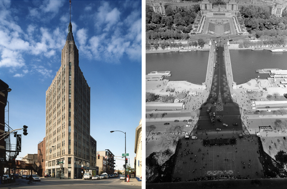
Ballot approaches his subject, the similarities and differences between the cities of Paris and Chicago, from an old-school, old-world perspective: classic, elegant, thoughtfully rendered photographs. Said thoughtful rendering is manifested in Ballot’s artistic choices, such as his decision to photograph Paris’s sculpture of yore, including Rodin’s timeless work, “The Kiss,” along with such modern Chicago installments as Calder’s “Flamingo,” setting up an old-world, new-world parallel. He also zeroes in on the architectural parallels of the metropoli, incorporating a shot of the Jay Pritzker Pavilion in Millennium Park, sandwiched between two photographs of the old staircase in the Musee de l’Orangerie. These shots are clever in a multitude of ways, because although the pavilion is metallic, abstract, and contemporary, suggesting the future, its sweeping arches and broken abstraction mirror the grandiose art-nouveau staircase, which is voluptuous and elegant, even in its state of abandonment and distress, made evident by the rubbish pile behind it. In this series, Ballot highlights the similarities and differences between Paris and Chicago with effortless grace.
Ballot’s most interesting incorporation, however, is a series of photographs of the interiors of museums. By integrating museums as the only indoor depictions in the show, Ballot singles them out as the soul of the city, its cultural pulse. Of course, there are the more typical gritty industrial shots, and sleek architectural photos. But it is Ballot’s museum pieces that really capture the essence of the cities, and by shooting them, he brings a kind of regal dignity not only to the museum displays he photographs, but to the cities to which they are home.
From Trash to Treasure…Literally.
“From trash to treasure” is a tired and clichéd expression. In the instance of Theolia Norwood’s current exhibit at the Chicago Cultural Center, however, saying that Norwood’s work materials have gone from trash to treasure wouldn’t be the quipping of an overused saying, so much as a literal statement of fact. In his exhibition, Urban Pastoral, Norwood takes city garbage and transforms it into serene country landscapes, where optimism and idealism pool comfortably in an imagined safe-haven.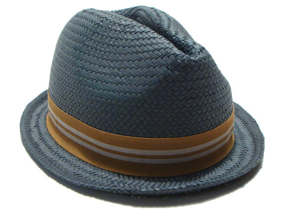
Being a semi-pretentious undergraduate who’s been exposed to more than her fair share of art-history lectures, my initial presumption was that the artist was making some sort of grand socio-political statement about the irrelevance of urban technology and the appreciation of natural beauty and simplicity. I was, however, informed I was wrong, in one of my more embarrassing moments on record. I was standing contemplatively in front of one of Norwood’s painting, when a friendly elder gentleman in a sharp navy suit, and a whimsical straw fedora stopped to ask me about the paintings. I told him what I liked, what I disliked, and then launched into a self-indulgent, presumptuous rant about social statements and symbolism, to which, the man, who turned out to be none other than Norwood himself, responded with a smiling honesty, telling me that it was never his intention to make some sort of grand philosophical statement. He just wanted to paint. Unable to afford canvases, he turned to discarded pizza boxes from an Aldi supermarket, and voila!—instant canvas.
Having this back story, it only makes sense that the artist–who is now working in his own studio provided by Project Onward, the Cultural Center’s program for disabled artists–would paint scenes with an aura of fond reminiscence and escapist beauty. Interestingly, the pieces painted on pizza boxes (approximately half the works) are actually brighter and more uplifting than those rendered on more legitimate surfaces. One such piece, “The S Curve” depicts thicks, soft, sunny electric green fir trees which filter sunlight, exuding a nature-induced optimism. In the center of the smiling green forest winds a country road done in soft grays, provoking the uncertainty of the future, not as ominous, but as promising, adventurous, and thrillingly unknown. Norwood’s upbeat interpretations of nature shine brightly in “Bottom of Tall Trees,” where the soft peppermint sea-foam greens of tree tops tower above to viewer, and everything is tinted with the bright, exaggerated hues of memory. The sky is a deep, rich indulgent blue, imaginatively aquatic. This exaggerated reminiscence only makes sense, as Norwood’s inspiration is rooted in his boyhood memories of Mississippi, and is his remembered woodlands are tinted with an element of the magical, creating the nostalgic fairytale forests that exist only in memory.
Straight From the Artist’s Mouth
Rodin was a man without an agenda. He said what he felt, and checked any facetious pretension at the door. He also sculpted what he felt, and the only way to truly understand the depth and purity of Rodin’s work, is to see it. Fortunately, the Loyola University Museum of Art is currently providing easy access to Rodin’s painfully sensitive renderings of the human experience at its latest exhibit, Rodin: In His Own Words.
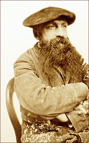
Despite what the beret may lead you to assume, the artist's quotes included in LUMA's new exhibit are far from cliche.
What’s genuinely fantastic about this particular exhibit is that it allows the viewer to hear exactly what the artist was thinking, not through a professorial middle man spouting theories and speculations, but from the refreshingly blunt honesty of the artist speaking straightforwardly about his intentions. Each caption incorporates a quote from Rodin, and purity and clarity are prevalent both in Rodin’s honest, poetic words and his equally honest and poetic sculptures, which personify the human struggle through the physical tension and muscular contortions of the figure while idealizing humanity simultaneously by revealing the beauty of this struggle. Surprisingly, the piece that personifies this best is not a large, towering sculpture, carrying obvious weight and grandeur, but rather, a small scale study, entitled “Smaller Right Clenched Hand” (1885). The hand, which is not entirely clenched, but rather in the early stages of clenching, is like a spiteful claw. Tense, angry, and brimming dangerously with life, the outward facing palm confronts the viewer with tight, muscular hills and valleys which personify passion and emotion in a purely physical way. Enhancing the beauty of this strange little sculpture is that, in its caption, Rodin speaks about the importance of using a live model, which is reflected in the obvious humanity in the presence of the hand.
Rodin was able to trap the beauty and fluidity of life in the stillness of his art, and this extraordinary gift made him a legend. Equally extraordinary, however, is the poetic sincerity of his words.
Olafur Eliasson: Liaison Between the Viewer and the Viewed
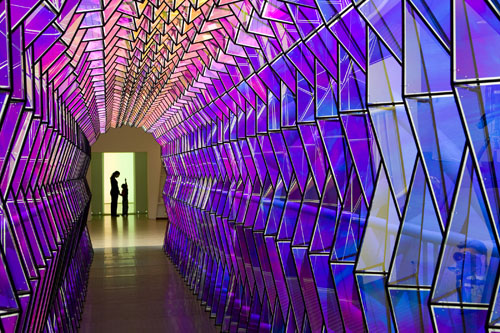 I have a very vivid memory of my first encounter with modern art. It was back in the days of elementary school, on a family trip, at the National Gallery in Washington D.C… I stepped on a strip of rubber on the museum floor, only to be informed by my father that I was standing on a piece from the museum collection. Ever since this encounter I have always tried to be very respectful of the boundaries between a work of art, and its viewer. Olafur Eliasson, however, appears to be aiming to completely destroy any sense of traditional art/viewer divisions in his experiential installation exhibit currently on display at the MCA entitled Take Your Time.
The major difference between Eliasson, and any traditional artist, is that his pieces are not something you see, they are something you experience. You cannot simply look at his work: you are confronted by it, immersed in it. It submerges, surrounds, and encapsulates the viewer demanding interaction. One such example of this is a gallery wall which is completely covered with live moss, fittingly titled “Moss wall” (1994). The moss dominates the gallery, creating a calm aura with its serene and eternal growth, but a large part of its intrigue is that it’s so bizarre. The moss wall is flanked by ordinary, sparse white gallery walls, leaving the viewer with the feeling that they’ve stumbled across a small piece of a magical forest in the middle of an industrial warehouse. Similarly enchanting and absurd is Eliasson’s earliest featured work, “Beauty” (1993), which is staged in a room which is pitch black, with the exception of a thin, soft, spotlight which filters through a light mist of water. The presence of something so mystical and so natural in a room with floors which are clearly made of rubber is again, both jarring and delightful, as is Eliasson’s request that we play along, and really engage with his work. This kind of give and take is also essential to any enjoyment of his kaleidoscope pieces, “One-way colour tunnel” (2007) and “Multiple Grotto” (2004), enormous structures which the viewer literally must step into in order to experience the surrealism of colored glass panels, and playful, seemingly natural, filtering light.
By asking the contemporary viewer to participate and engage with his work, Eliasson proves that art need not sit pretentiously on a pedestal to be great. In fact, it leaves a startling and enchanting impression when placed in the hands (and under the feet) of the viewer.
leave a comment